The Curious Experience Of Visiting The Museum of Contemporary Art in Sydney
The Museum of Contemporary Art Sydney AKA MCA
The Museum of Contemporary Art in Sydney presents itself as a bold cultural landmark, yet the experience inside often feels strangely hollow, as though the building is waiting for an exhibition that never quite arrives. Visitors approach expecting a dynamic world of creativity, only to find long stretches of empty space, installations that seem to prioritise concept over substance, and a general sense that the building is unsure of what it wants to be.
The contrast between its reputation and its reality becomes even more striking when compared with places like MONA in Tasmania, which embraces its eccentricity with confidence and fills every corner with something unexpected. At the MCA, the atmosphere feels muted, as if the art is whispering from a distance rather than inviting you into its world. This creates an experience that is not unpleasant, but undeniably underwhelming, leaving many visitors wondering how such a prominent institution can feel so strangely incomplete.

The First Impression Of The Building
How The Exterior Sets The Tone
The exterior of the MCA Sydney carries a sense of architectural ambition, yet the building’s surfaces often appear weathered and marked by layers of dirt that dull the impact of its design, creating an impression of neglect rather than artistic grit. Approaching the entrance, visitors notice the contrast between the harbour’s brightness and the building’s muted facade, which feels more tired than intentionally industrial.
This first impression shapes expectations, suggesting a space that may not have been maintained with the care one would expect from a major cultural institution. The building’s scale promises something grand, yet the details hint at a lack of attention that becomes more noticeable once inside. This early disconnect sets the stage for an experience that feels strangely unfinished.
| Exterior Element | Observation |
|---|---|
| Building Surface | Noticeably dirty and weathered |
| Architectural Style | Ambitious but muted |
| Entrance Area | Lacks vibrancy |
| Overall Impression | Underwhelming first encounter |
The Initial Galleries
Why The Opening Rooms Feel Sparse
The first galleries inside the MCA often feel surprisingly empty, with large stretches of wall space left bare and installations spaced so widely that the rooms echo more than they engage. Visitors expecting a burst of creativity are instead met with a quietness that feels less intentional and more like a missed opportunity. The minimalism might be interpreted as conceptual restraint, yet the absence of visual energy makes the space feel incomplete rather than contemplative. This sparseness creates a sense of distance between the viewer and the art, as though the building is holding back rather than inviting exploration. The result is an opening experience that feels oddly quiet for a contemporary art museum.
- Large empty wall areas
- Installations spaced too widely
- Lack of visual energy
- Quiet atmosphere without intention
- A sense of missed opportunity
The Arrogance Of Certain Displays
How Presentation Overshadows Substance
Some installations at the MCA carry an air of conceptual arrogance, presenting themselves with a seriousness that feels disproportionate to the amount of actual content on display. The explanatory panels often speak in dense, academic language that seems designed to elevate the work rather than clarify it, creating a barrier between the viewer and the art. This approach can make the experience feel more like a lecture than an exploration, as though the museum expects visitors to admire the idea rather than engage with the piece itself. The imbalance between presentation and substance becomes more noticeable when the artwork occupies only a small portion of an otherwise empty room. This creates a sense of theatricality without depth.
| Display Feature | Effect |
|---|---|
| Dense Text Panels | Creates distance |
| Minimal Artwork | Feels disproportionate |
| Serious Tone | Overstates significance |
| Sparse Layout | Reduces engagement |
The Staff Experience
Why The Human Element Feels Mixed
The staff at the MCA are generally friendly and helpful, yet there is an unmistakable sense that many of them appear weary, as though the monotony of the space has worn down their enthusiasm. Their professionalism remains intact, but the spark that often defines passionate gallery staff feels dimmed by the environment they work in. Visitors may notice polite smiles that fade quickly or explanations delivered with a tone that suggests repetition rather than excitement. This is not a reflection of their ability but rather the atmosphere of the museum, which does little to energise those who spend their days within it. The human element becomes another subtle reminder of the museum’s lack of vibrancy.
- Friendly but tired demeanour
- Professional interactions
- Repetitive explanations
- Atmosphere affecting staff energy
- Politeness without enthusiasm
The Comparison With MONA
How Another Gallery Highlights The Contrast
Comparing the MCA with MONA in Tasmania reveals a striking difference in ambition, execution, and emotional impact, as MONA embraces its strangeness with confidence while the MCA feels hesitant and incomplete. MONA fills every corner with something unexpected, creating a sense of discovery that keeps visitors engaged from the moment they enter. In contrast, the MCA’s emptiness feels unintentional, as though the museum is waiting for an exhibition that never fully arrives. The contrast highlights how contemporary art can be bold and immersive without sacrificing accessibility or substance. This comparison underscores the MCA’s struggle to create a meaningful experience.
| Gallery | Experience |
|---|---|
| MONA Tasmania | Strange, bold, full of art |
| MCA Sydney | Sparse, muted, lacking energy |
| Visitor Engagement | High at MONA, low at MCA |
| Atmosphere | Immersive vs. underwhelming |
The Digital Installations
Why The Back Of The Screens Steals The Show
One of the most surprising aspects of the MCA experience is that the backs of the digital installations often appear more visually interesting than the artworks they support, revealing cables, structures, and technical elements that unintentionally outshine the displays. This unintended fascination highlights the lack of depth in some of the digital pieces, which rely heavily on concept without offering much visual or emotional engagement. The contrast between the polished front and the exposed back creates a sense of imbalance that draws attention away from the intended experience. Visitors may find themselves lingering behind the screens, intrigued by the raw mechanics rather than the art itself.
- Exposed cables and structures
- More visual interest behind the screens
- Digital pieces lacking depth
- Unintentional focus shift
- Technical elements overshadowing art
The Souvenir Shop
How The Gift Store Outshines The Galleries
The souvenir shop at the MCA unexpectedly becomes one of the most engaging parts of the visit, offering a lively mix of books, prints, objects, and curiosities that feel more vibrant and thoughtfully curated than many of the galleries. The shop is filled with colour, texture, and variety, creating a sense of discovery that contrasts sharply with the sparse exhibition spaces.
Visitors often spend more time browsing the merchandise than viewing the art, not because the shop is extraordinary but because it offers a level of stimulation missing from the rest of the museum. This imbalance raises questions about the priorities of the institution and the experience it aims to create. The shop becomes a highlight by default rather than design.
| Shop Feature | Appeal |
|---|---|
| Colourful Merchandise | Visually engaging |
| Wide Variety | Encourages browsing |
| Thoughtful Curation | More stimulating than galleries |
| Visitor Experience | Surprisingly enjoyable |
The Wasted Space
Why The Building Feels Underused
The MCA occupies a large and prominent building, yet much of the interior feels underutilised, with vast open areas that contribute little to the visitor experience. These empty spaces create a sense of anticipation that is rarely fulfilled, as though the museum is waiting for an exhibition that never quite materialises. The scale of the building suggests potential for immersive installations, yet the reality is a series of rooms that feel disconnected and lacking in purpose. This underuse of space diminishes the impact of the art that is present, making even strong pieces feel isolated. The overall impression is one of missed opportunity.
- Large unused areas
- Lack of immersive installations
- Disconnected room layouts
- Underwhelming use of scale
- Missed potential throughout the building
The Confusing Exhibition Layout
How The Flow Disrupts The Experience
The layout of the MCA often feels disjointed, with rooms that do not lead naturally into one another and transitions that lack thematic or visual continuity, creating a sense of wandering rather than exploring. Visitors may find themselves unsure whether they have missed an exhibition or simply walked through another empty space, as the museum offers few cues to guide the experience. This lack of cohesion makes the journey feel fragmented, as though the building is presenting isolated ideas rather than a curated narrative.
The confusion is not stimulating in the way contemporary art can be, but instead leaves visitors feeling detached from the experience. The result is a museum visit that feels more like navigating a maze of missed opportunities.
| Layout Issue | Visitor Impact |
|---|---|
| Disconnected Rooms | Breaks immersion |
| Poor Flow | Creates confusion |
| Sparse Signage | Reduces clarity |
| Inconsistent Themes | Weakens engagement |
The Overreliance On Conceptual Minimalism
Why Less Does Not Always Mean More
Minimalism can be powerful when used with intention, but at the MCA it often feels like a default rather than a deliberate artistic choice, leaving rooms that feel empty rather than thoughtfully restrained. The absence of visual density creates a sense of emotional distance, as though the museum is hesitant to commit to bold artistic statements. Visitors may find themselves searching for meaning in spaces that offer little to hold their attention, creating an experience that feels more like waiting than observing. This approach contrasts sharply with institutions that use minimalism to heighten impact rather than reduce it. The imbalance between concept and execution becomes increasingly noticeable as the visit continues.
- Minimalism without emotional depth
- Rooms lacking visual anchors
- Concept overshadowing experience
- Reduced sense of discovery
- Missed opportunities for impact
The Sound Installations
How Audio Fails To Fill The Space
Sound installations at the MCA often struggle to create the immersive environments they aim for, as the large, echoing rooms dilute the intended effect and leave the audio feeling thin and disconnected. Instead of enveloping the visitor, the sound drifts through the space without direction, creating an atmosphere that feels more accidental than intentional. The lack of accompanying visual elements further weakens the impact, making the installations feel incomplete. Visitors may find themselves unsure whether they are experiencing the artwork or simply hearing ambient noise from another room. This ambiguity diminishes the potential of sound as a medium.
| Sound Element | Outcome |
|---|---|
| Echoing Rooms | Weakens immersion |
| Sparse Visuals | Reduces context |
| Directionless Audio | Creates confusion |
| Low Emotional Impact | Limits engagement |
The Lack Of Artistic Density
Why The Museum Feels Empty
One of the most striking aspects of the MCA is the sheer amount of unused space, which creates an impression that the museum is holding back rather than showcasing the full breadth of contemporary art. Visitors expecting a rich, layered experience instead encounter long stretches of bare walls and open floors that contribute little to the atmosphere. This emptiness makes the few pieces on display feel isolated, as though they are standing alone in a space that was meant to hold far more. The result is a museum that feels strangely quiet, lacking the energy that comes from a diverse and abundant collection. This scarcity becomes one of the defining characteristics of the visit.
- Sparse displays
- Isolated artworks
- Underwhelming atmosphere
- Lack of visual richness
- Reduced sense of discovery

The Missed Emotional Connection
How The Museum Struggles To Engage
Art has the power to evoke emotion, provoke thought, and create lasting impressions, yet the MCA often struggles to generate these responses due to its restrained and distant presentation style. The lack of narrative cohesion makes it difficult for visitors to form a connection with the works, as each piece feels like an isolated idea rather than part of a larger conversation.
This emotional disconnect is compounded by the sparse layout, which leaves visitors feeling more like observers of empty rooms than participants in an artistic experience. The museum’s approach seems to prioritise concept over connection, resulting in an experience that feels intellectually thin and emotionally muted. This absence of resonance becomes one of the most memorable aspects of the visit.
| Engagement Factor | Effect |
|---|---|
| Weak Narrative Flow | Reduces emotional impact |
| Sparse Presentation | Limits connection |
| Concept Over Experience | Creates distance |
| Lack Of Immersion | Weakens memory |
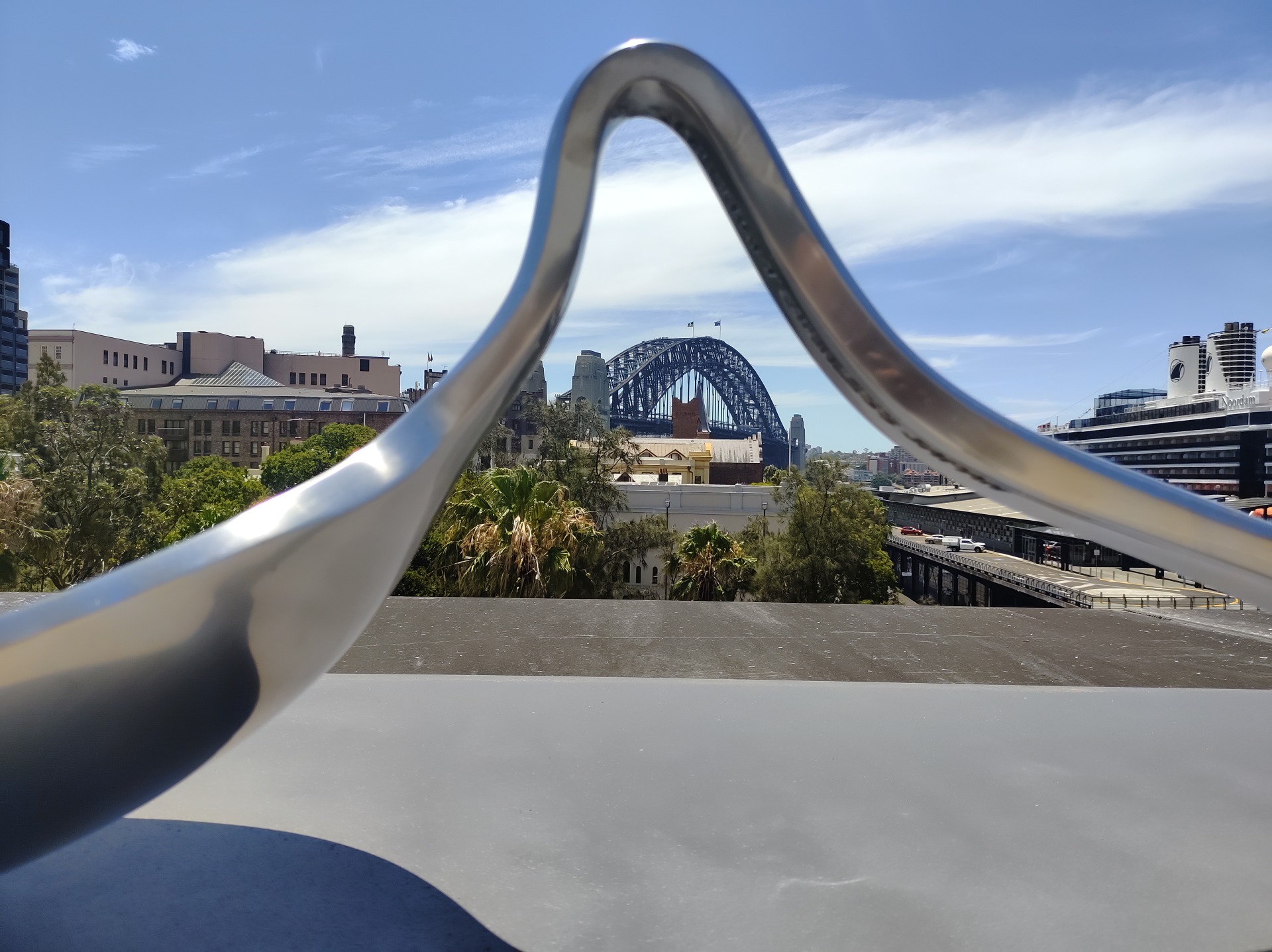
The Rooftop And Surrounding Views
Why The Setting Outshines The Art
The rooftop and surrounding harbour views offer a level of beauty and vibrancy that stands in stark contrast to the muted atmosphere inside the museum, creating a moment of relief for visitors seeking stimulation. The natural light, open air, and sweeping scenery provide a sense of clarity that the interior spaces struggle to match. Many visitors find themselves lingering outside longer than expected, drawn to the energy of the harbour rather than the exhibitions. This contrast highlights the museum’s inability to compete with its own surroundings. The setting becomes a reminder of the potential the museum has yet to fulfil.
- Harbour views more engaging than galleries
- Natural light creating stronger atmosphere
- Visitors lingering outdoors
- Contrast highlighting interior shortcomings
- Setting overshadowing exhibitions
The Temporary Exhibitions
How Rotating Displays Struggle To Impress
Temporary exhibitions at the MCA often feel inconsistent, with some offering glimpses of creativity while others feel underdeveloped or lacking in cohesion. The rotating nature of these displays means that the museum’s identity shifts frequently, making it difficult for visitors to understand what the institution stands for. Some exhibitions show promise but are presented in ways that fail to maximise their impact, while others feel like placeholders rather than fully realised artistic statements. This inconsistency contributes to the overall sense of uncertainty that permeates the museum. The temporary nature of the displays becomes another reminder of the museum’s struggle to define itself.
| Exhibition Type | Visitor Response |
|---|---|
| Strong Concepts | Undermined by sparse presentation |
| Weak Installations | Feel like placeholders |
| Rotating Displays | Create identity confusion |
| Missed Opportunities | Reduce impact |

The Overall Visitor Experience
Why The Museum Leaves A Faint Impression
The MCA Sydney ultimately leaves visitors with an impression that is more defined by what is missing than by what is present, creating a sense of curiosity that never fully transforms into engagement. The combination of empty spaces, conceptual displays, and muted atmosphere results in a visit that feels strangely incomplete. While the staff remain polite and the building holds potential, the museum struggles to deliver an experience that resonates emotionally or intellectually. Visitors may leave feeling puzzled rather than inspired, wondering how such a prominent institution can feel so underwhelming. The faintness of the experience becomes its most defining feature.
- Experience defined by absence
- Lack of emotional resonance
- Underwhelming atmosphere
- Polite but weary staff
- A sense of puzzling incompleteness
The Museum of Contemporary Art Sydney AKA MCA – Photos By Mike Fernandes
Conclusion
The MCA Sydney stands as a museum filled with potential yet held back by sparse displays, muted atmosphere, and an approach to contemporary art that feels more hesitant than bold. Its vast spaces, conceptual ambitions, and prime location suggest a cultural powerhouse, yet the reality is a museum that struggles to create meaningful engagement or emotional impact. The contrast with institutions like MONA highlights how contemporary art can be strange, challenging, and immersive without sacrificing substance or energy.
While the staff remain professional and the building offers moments of beauty, the overall experience feels incomplete, as though the museum is waiting for a spark that has yet to arrive. The MCA remains a place worth visiting once, but it leaves visitors hoping for a future where its potential is finally realised.
Join The Discussion
Your perspective adds to the ongoing conversation about how contemporary art spaces can evolve and improve.
#MCASydney #SydneyArt #ContemporaryArt #ArtCritique #SydneyCulture #MuseumExperience